Pastel Outfits: Inspiring Soft-Tone Design for Your World
Unlock the Gentle Power of Pastels
Ready to refresh your aesthetic with a touch of sophisticated calm? This article will guide you through translating the latest pastel fashion trends into a cohesive, soft-tone design philosophy for both your wardrobe and your living spaces. You’ll gain actionable insights to curate a look that feels effortlessly chic and utterly modern.
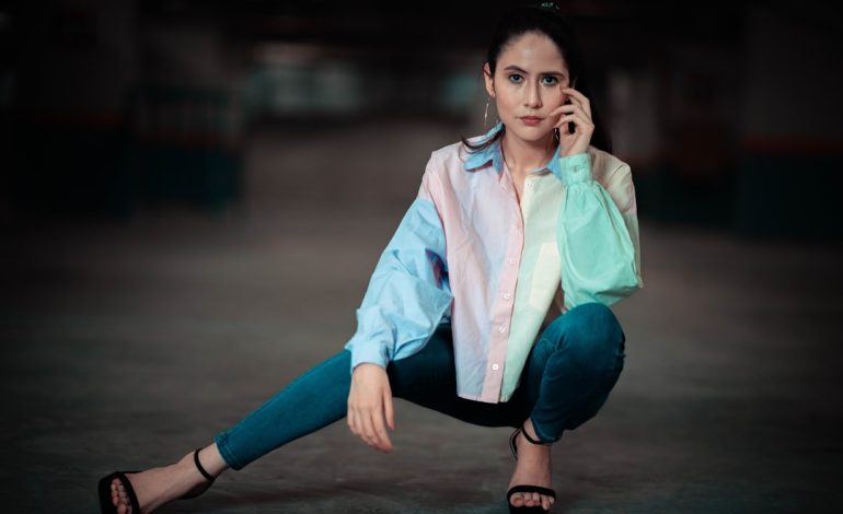
Forget everything you thought you knew about pastels being overly sweet. Today, these muted hues are all about understated elegance and versatile styling. Get ready to embrace a palette that brings tranquility and a fresh perspective to your everyday.

The Pastel Evolution: Beyond Sweetness
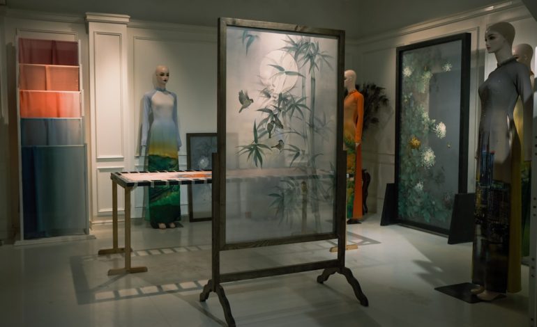
Pastels have truly grown up. What was once relegated to spring flings and baby showers has blossomed into a sophisticated, year-round staple. We’re seeing a shift from vibrant, sugary shades to more muted, almost dusty tones – think soft sage, lavender haze, butter yellow, and muted peach. These aren’t just colors; they’re a mood, a whisper of luxury that feels incredibly current.
Designers are embracing these hues in monochromatic looks, subtle color blocking, and as foundational elements for layered ensembles. It’s about creating depth and interest without relying on bold contrasts, proving that soft doesn’t mean weak. This refined approach to color is what makes pastels so inspiring for broader design applications.
But here’s the real talk: while these ethereal shades are pure magic on the runway and in carefully curated feeds, bringing them into your everyday grind comes with its own set of subtle challenges. The very softness that makes them so appealing also means they’re less forgiving. Think about it – that dreamy butter yellow trench or sage green silk blouse? They’re magnets for life’s little mishaps. A stray coffee splash, a smudge from a busy commute, or even just the wear and tear of a day out can quickly dim their pristine glow. This isn’t just about cleaning; it’s about the constant vigilance required to maintain that ‘whisper of luxury,’ which can sometimes feel like a full-time job.
And while the monochromatic pastel moment is undeniably chic, translating that seamless vision from editorial spreads to your actual wardrobe isn’t always a walk in the park. The subtle differences in fabric textures and dyes can make matching ‘muted’ shades surprisingly tricky, often resulting in a look that feels less cohesive and more disjointed than intended. Plus, the wrong undertone in a pastel can easily wash out your complexion, turning that ‘lavender haze’ into a ‘pale plight’ rather than a radiant glow. It’s a delicate balance that demands a keen eye and a bit more styling savvy than a bold, straightforward hue.
There’s also a quiet pressure that comes with embracing such soft tones. In environments where assertiveness or a strong presence is key, relying too heavily on pastels might inadvertently dilute your visual impact. While sophisticated, their inherent gentleness can sometimes be misread, requiring a more intentional approach to accessorizing or tailoring to ensure your outfit communicates the confidence and strength you embody. It’s a subtle dance between embracing softness and projecting power, a nuance often overlooked when we’re swept up in the aesthetic appeal.
From Runway to Room: Translating Soft Tones
The beauty of fashion’s current pastel obsession is how easily it translates into other design realms. Think of a perfectly curated pastel outfit – the way different textures and shades play together. You can apply this exact same principle to your home decor or even your digital presence.
- Interior Design: Imagine a living room where a soft mint sofa is paired with cream textiles and a muted rose throw. The same balance of color and texture you’d find in a chic outfit.
- Graphic Design: Websites and branding are adopting soft pastel palettes to evoke a sense of calm, approachability, and modern elegance, moving away from harsh, saturated colors.
- Personal Branding: Even your social media feed can benefit from a cohesive pastel aesthetic, reflecting a thoughtful and serene online persona.

Actionable Tip: When seeking inspiration for your space, don’t just look at interior design magazines. Flip through fashion lookbooks for Spring/Summer 2026. Pay attention to how colors are combined, how light plays on different fabrics, and how accessories complete a look. These visual cues are goldmines for translating style across mediums.
But here’s the real talk: while the aesthetic appeal of soft tones is undeniable, translating them flawlessly isn’t always a walk in the park. It’s easy to get swept up in the dreamy visuals, overlooking the practicalities. That gorgeous mint sofa? It’s also a magnet for everyday life’s little mishaps, demanding a higher level of vigilance to keep it looking pristine. And while the goal is serenity, an overdose of pastels without enough grounding elements or textural contrast can sometimes tip into blandness, losing that sophisticated edge and instead feeling a bit too saccharine or uninspired.
Another subtle snag often missed is the longevity factor. Trends, by nature, evolve. While pastels are having their moment, committing to significant, high-investment pieces in these ephemeral hues can lead to a quiet frustration down the line when the aesthetic inevitably shifts. What feels utterly fresh and modern today might, in a few seasons, feel dated, creating pressure to update sooner than you’d planned. It’s a classic theory-vs-practice dilemma: the immediate gratification of a trendy look versus the long-term commitment of a substantial design choice.
Curating Your Soft-Tone Aesthetic
Ready to infuse your world with these gentle hues? Here’s how to start curating your soft-tone aesthetic, whether it’s for your closet or your home:
For Your Wardrobe:
- Layering is Key: Combine different pastel shades and textures. A silky lavender camisole under a chunky knit cardigan in a soft grey or cream creates instant depth.
- Accessorize Smart: A pastel handbag, shoes, or even delicate jewelry can elevate an otherwise neutral outfit. Don’t be afraid to mix and match different pastel accessories.
- Monochromatic Magic: An all-one-color pastel outfit (think head-to-toe soft blue or sage green) is incredibly chic and elongating.

For Your Space:
- Start Small: Introduce pastel accents with throw pillows, blankets, or decorative vases before committing to larger pieces.
- Wall Power: A single accent wall in a soft pastel can transform a room without overwhelming it. Think muted blush in a bedroom or a pale sky blue in a home office.
- Mix with Neutrals: Pastels truly shine when paired with grounding neutrals like cream, beige, light grey, or even natural wood tones. This prevents the space from feeling too